Macy’s Help Center
In 2018 Macy’s call center received 18 million calls - each costing on average $1.72. Customer service leadership believed that a significant portion of those calls could have been better addressed through other online channels such as self-service flows, and chat.
In an effort to reduce calls and operational costs, we set out to make our online help more easily accessible and more effective in guiding customers to the appropriate channels.
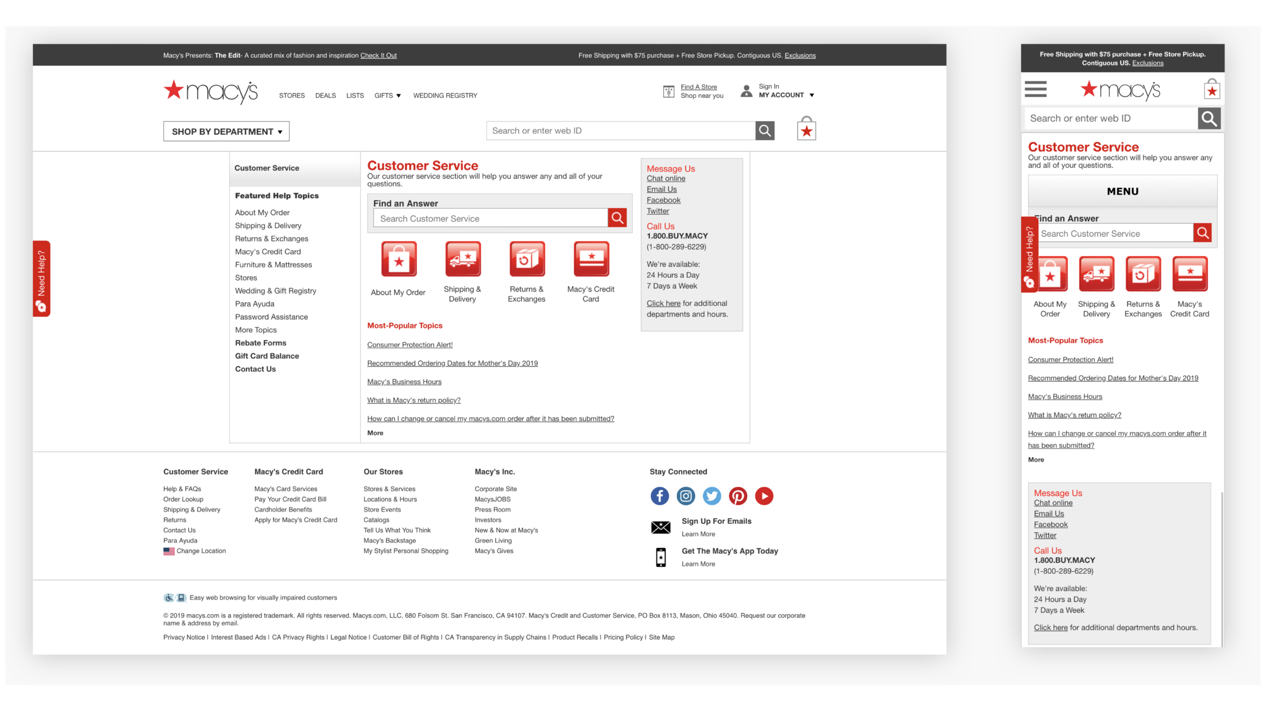
The Current Experience
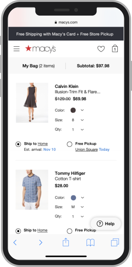
Macy's offered various ways to get help on their Help Center.
Unfortunately, it wasn't easy for customers to navigate to them.
It also wasn't clear to customers how to resolve their issue in the least amount of time and effort.
Design Goals
Help signed-in and guest customers resolve issues with less effort, in a way that is convenient for them by…
Making help more easily accessible
Guiding customers to the right help channel
We’ll know know we are successful if…
We reduce inquiry rates for self-service issues
Customers can successfully find optimal help channels
We don’t negatively impact conversion rate on Bag and Checkout pages
My team
My Role
Sole/lead designer
Created test plans, and prototypes for user testing
Presented prototypes / animations to VPs with my product manager
Created specs, collaborated with Devs
Managed design stories in sprints, daily stand-ups with help from my project manager
Went to Macy’s Customer Service to shadow agents - learn agent and customer pain points
The Improved Experience
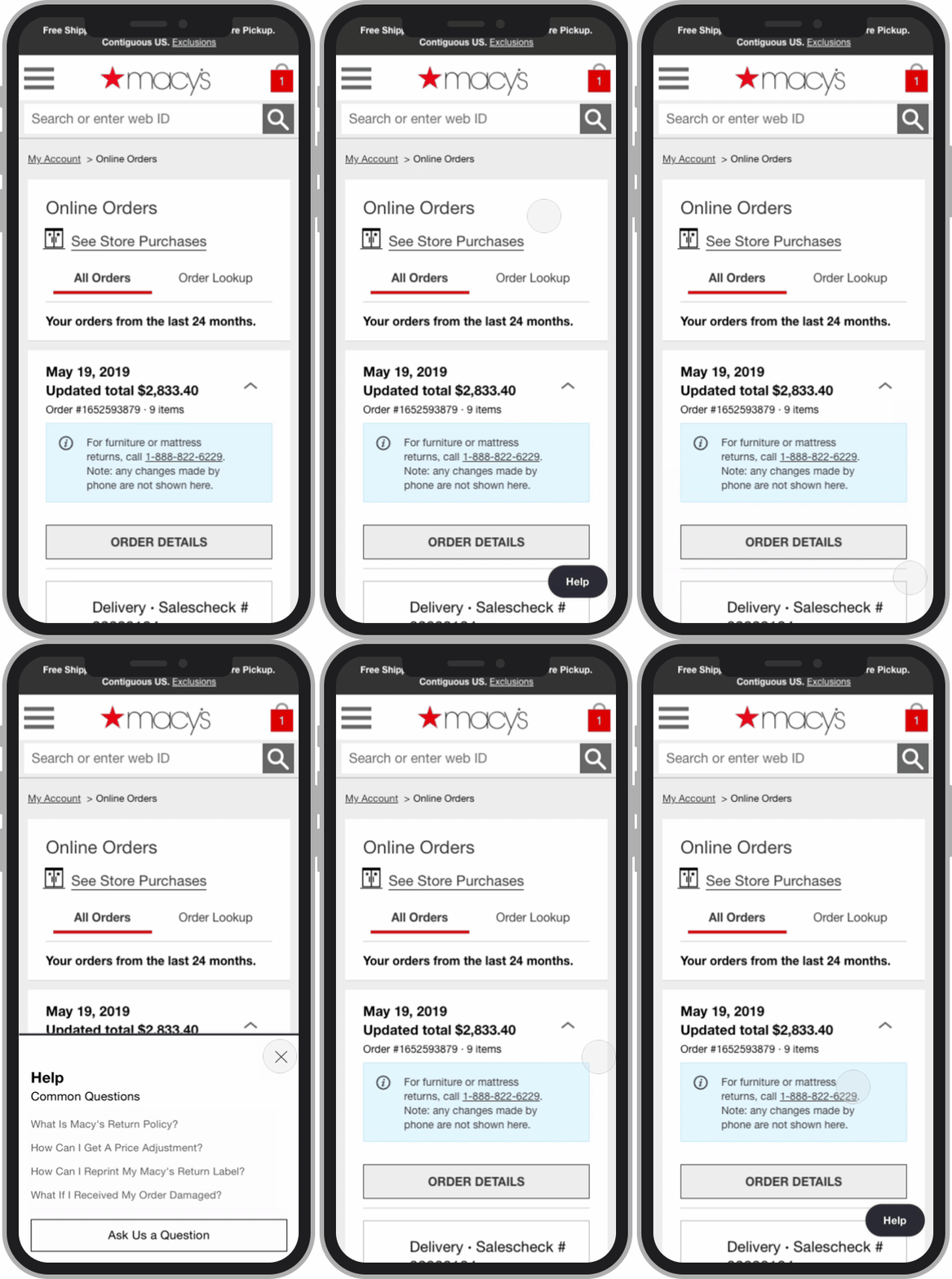
Making help more easily accessible
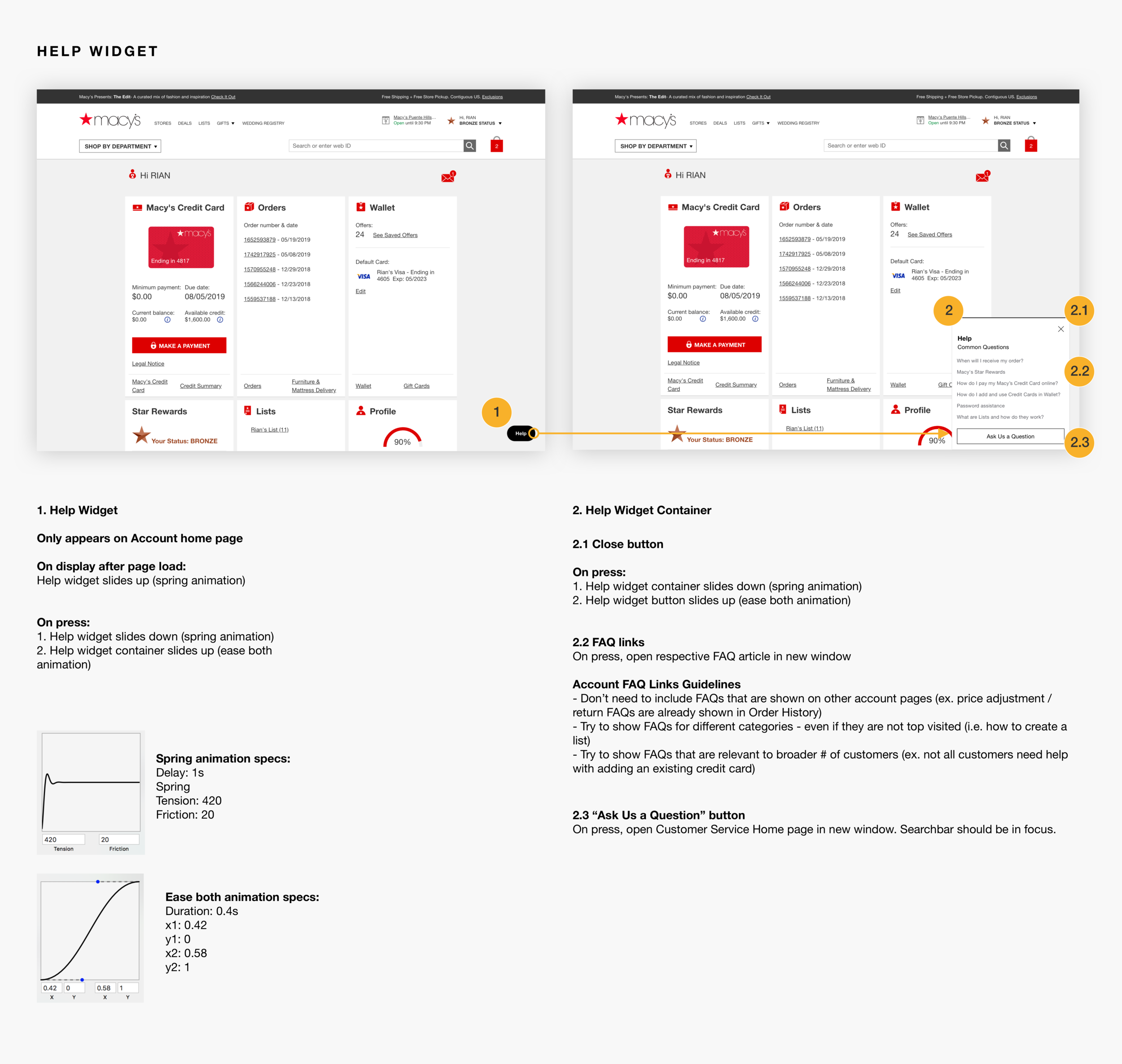
Customers can press on the floating help widget in the lower right corner of their screen to get access to contextually relevant FAQs.
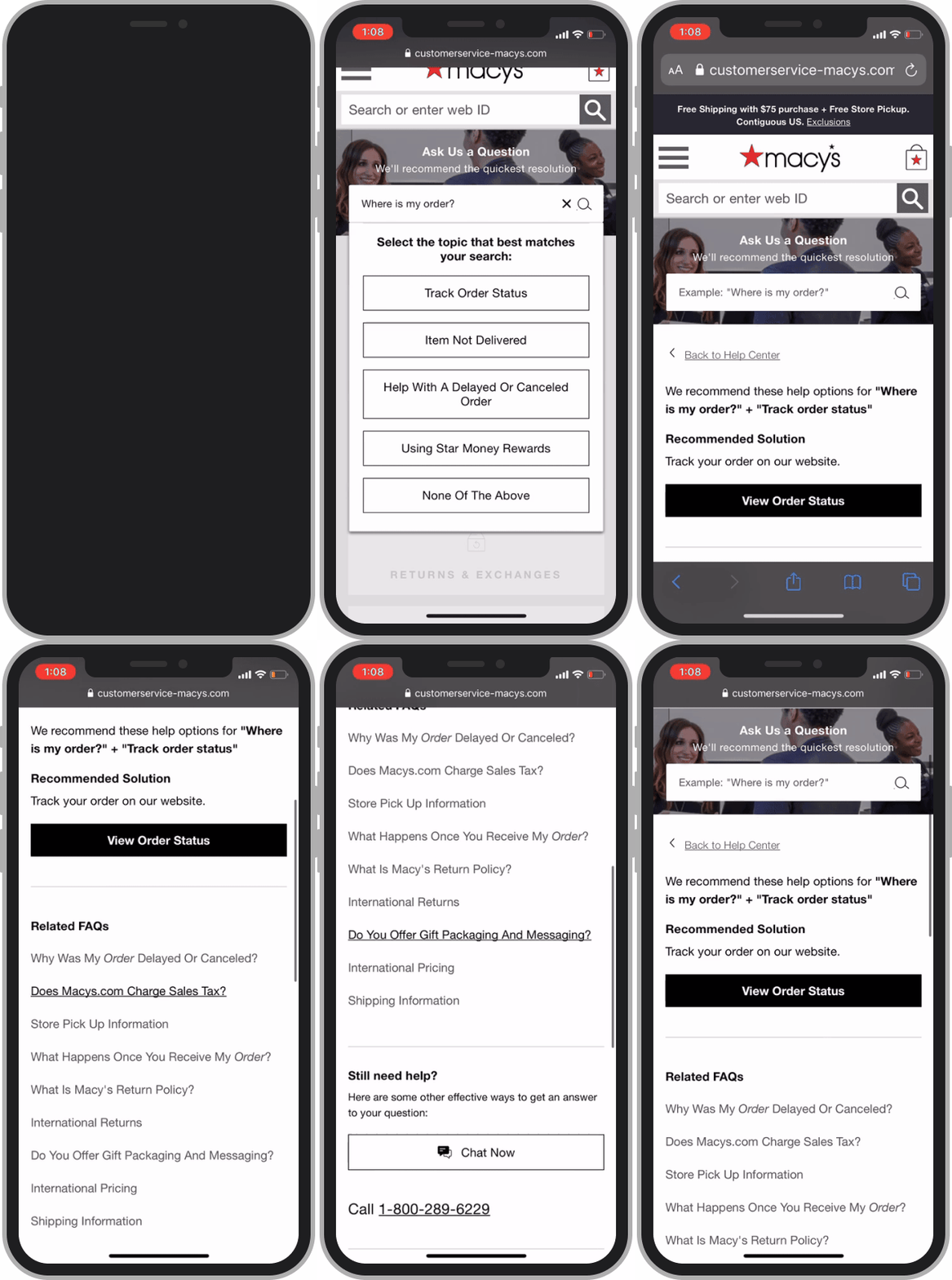
Guiding customers to the right help channel
Customers can see recommended self-service solutions and contact options when they search for help.
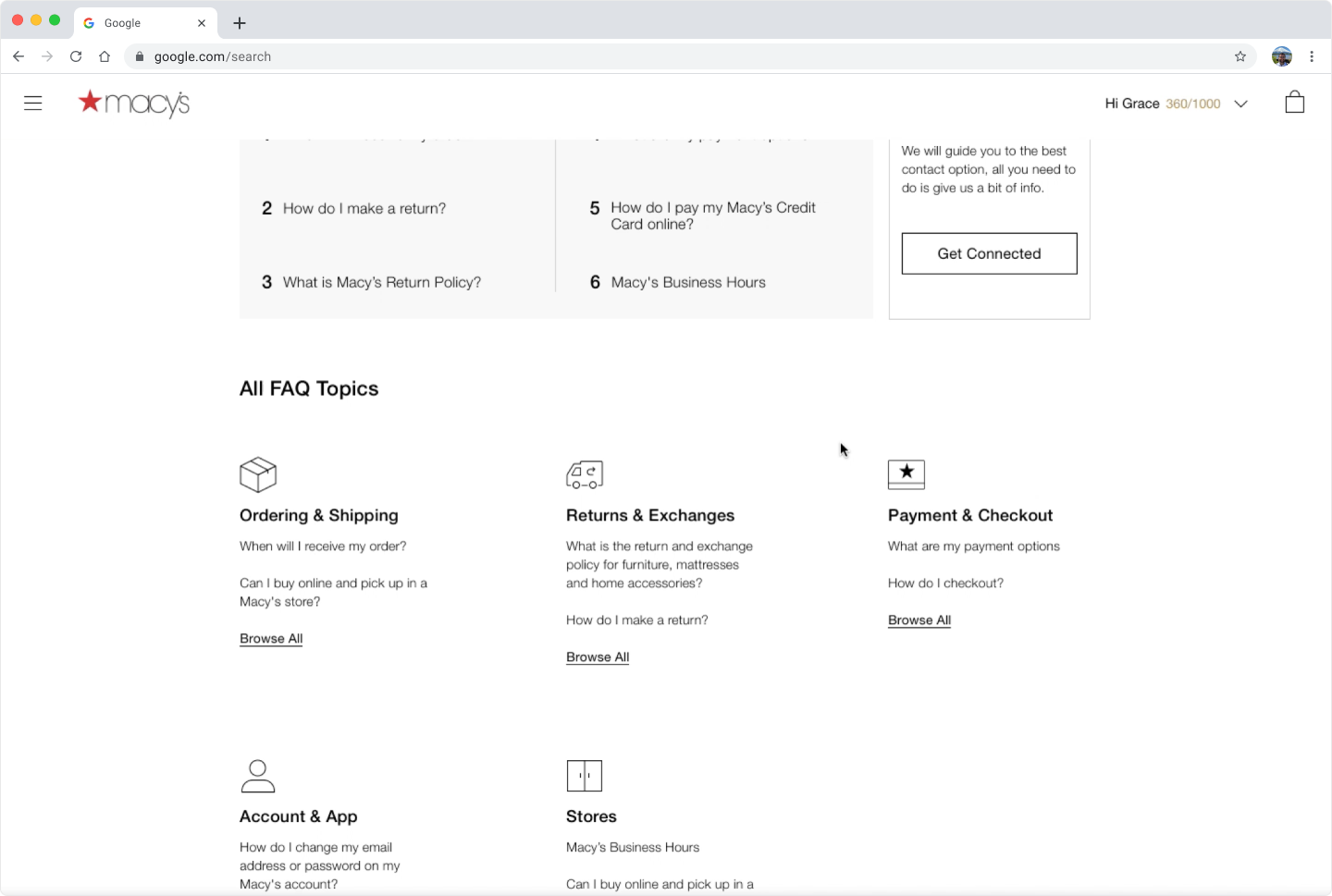
A cleaned up Help Center
Customers can more easily scan the Help Center page, find top FAQs and recommended channel options.
Before
After
My Design Journey
I went through several rounds of iteration with the help widget, channel guidance, and the help center, collecting feedback from customers 🙍♀️ and stakeholders ★. Here is what I learned.
Widget Styling
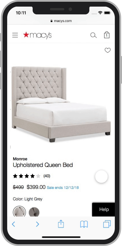
Our team was concerned that a widget, permanently fixed to the bottom corner of the screen, might possibly interfere or deter customers from converting. We also noticed more subtle widgets were hard for customers to discover, especially on desktop. I explored a combination of color and scrolling animation to make the widget discoverable when necessary, without interrupting the shopping experience.
v1
v2
v3
v1
v2
Widget Interaction
Early on I explored the help widget ingressing to a full page modal that shows relevant help. I replaced the modal with a drawer so customers could view FAQs in context with the parent page.
Navigating to Contact Channels
In user testing, I found that participants sometimes come to the Help Center immediately looking for contact channels, rather than trying to self help first. These participants were frustrated with having to answer several questions before seeing recommended channels. At the same time Macy’s was concerned about surfacing the more expensive agent chat and call channels. We ultimately found a compromise - include the contact options on the Help Center page, but towards the bottom of the screen. Before navigating to the contact options, customers would scroll through FAQ categories, and the search bar, which guides customers to helpful contact options depending on their inquiry.
Visual Hierarchy
Early versions of the Help Center showed more FAQs up front. I used cards with a hover effect so that customers could first find the category they needed help with, and then find the FAQ relevant to their issue. This made the screen more easily scannable.
v1
v2
Implementation
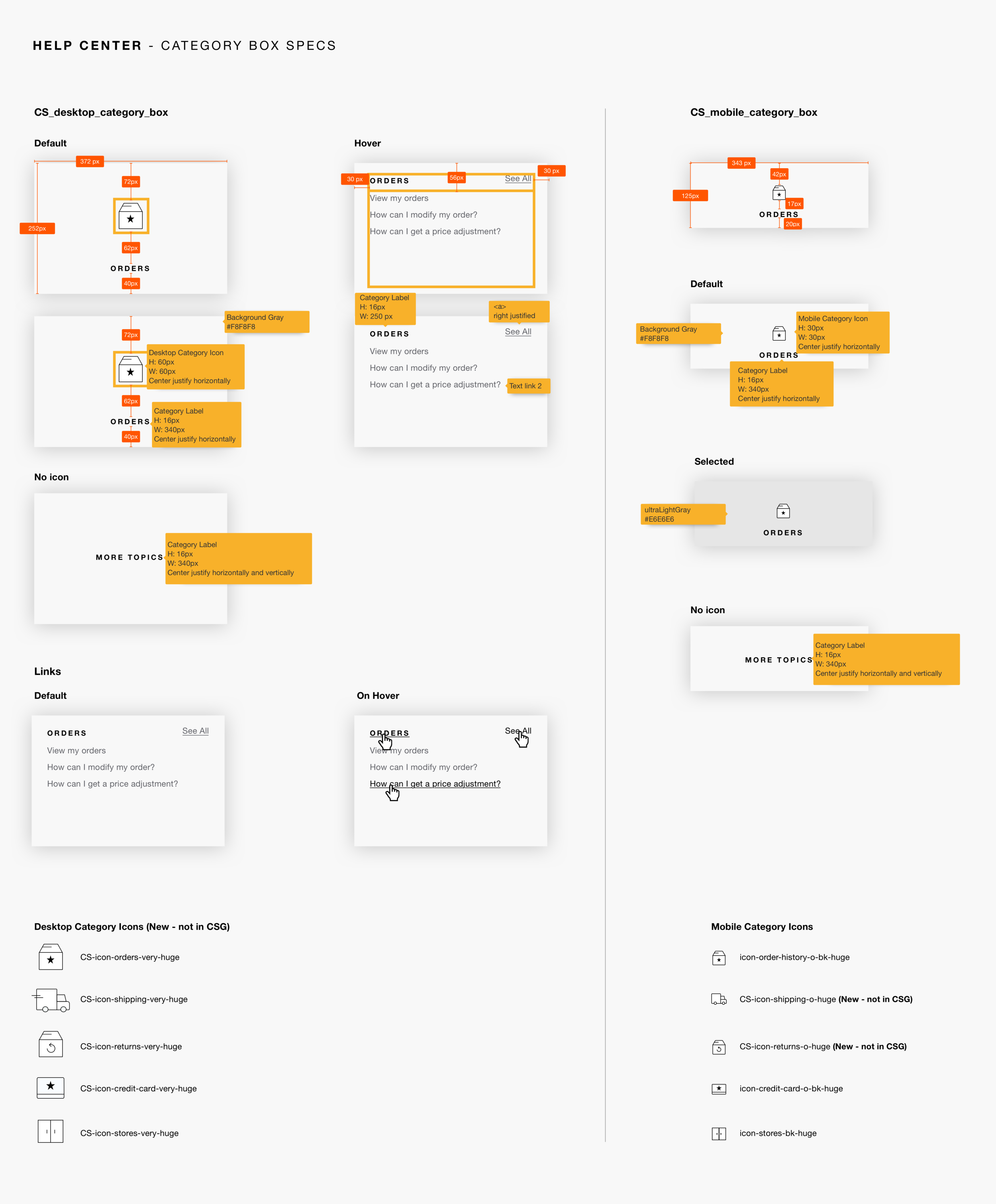
I shared UI specs with frontend developers and helped them implement the validated designs. Below are a few examples of the specs I provided.
Outcomes
There has been a ~16% decrease in the monthly inquiry rate. We don’t know inquiry rates for specific issues yet.
69.7% of help center visitors used channel guidance. 50% selected recommended channel.
We plan to run a “Do No Harm” experiment for help widget on Bag and Checkout pages.
Next Steps
How might we…
Reduce unnecessary calls further?
Provide more accessible, consistent help access across the site?
Direct more customers to channel guidance, and ultimately help them quicker?
