Dexcom G6 CGM App Home Screen
In 2017, Dexcom wanted to update the design of their flagship continuous glucose monitoring app. The Home Screen is the most important screen of the app - it gives users important information regarding the status of their glucose levels and helps them make treatment decisions.
The Dexcom G5 system
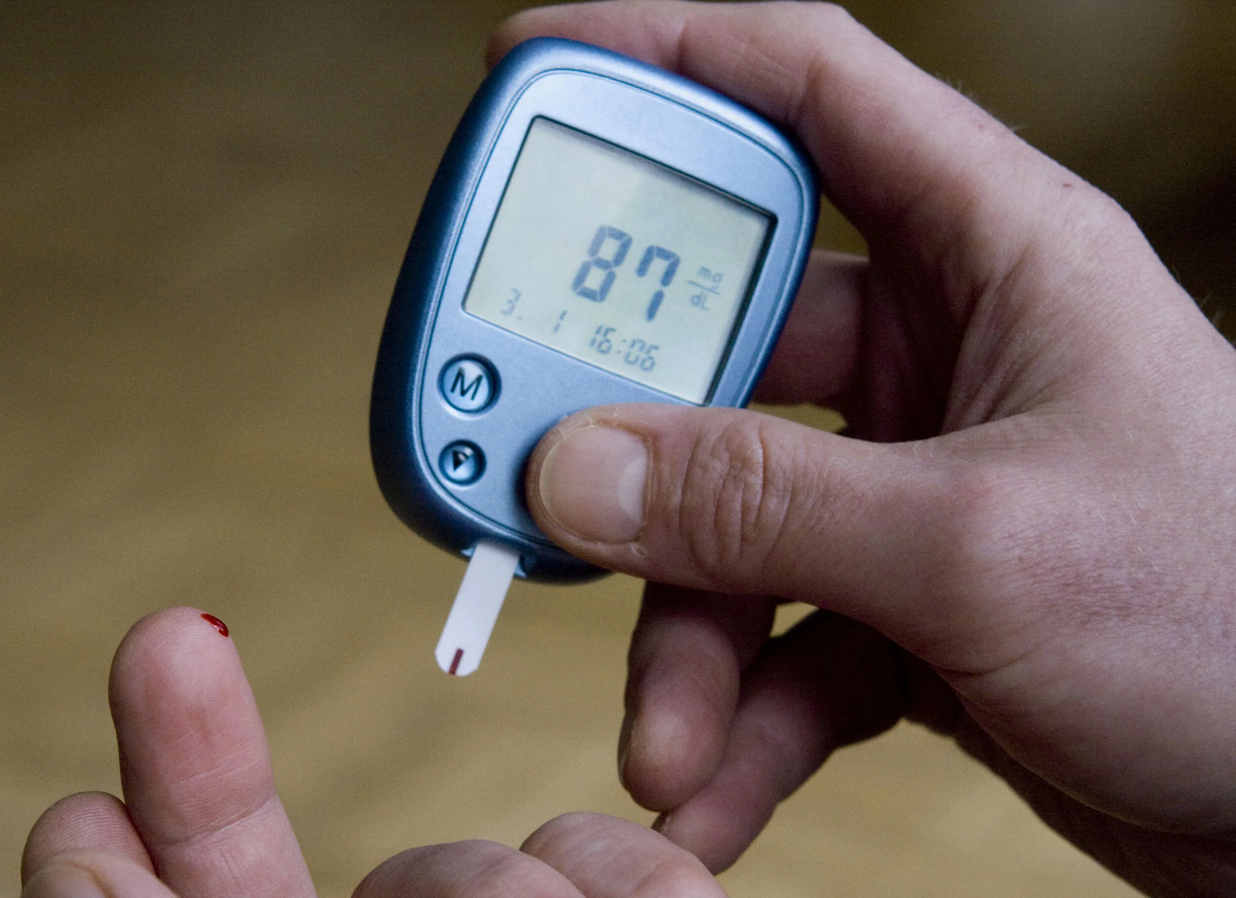
Users calibrate their Dexcom system with a blood glucose reading
Background
Our target users - people living with Type 1 Diabetes - aim to keep their glucose levels within a range that they set with their health care provider. Going outside of that range can be dangerous. In some cases, severe low or high glucose levels require medical attention.
They make treatment decisions, such as dosing insulin or eating food, based off of their glucose level.
In order to keep their Dexcom system accurate they need to calibrate it with a blood glucose reading from a blood glucose monitor (see left).
At the time Dexcom wanted to update their app to include iOS components to make it easier to maintain.
My Team
Me (UX/UI designer)
Visual Designer
Project Manager
Marketing Manager
Human Factors Engineer
Developers
My Role
UX/UI designer
Managed design planning
Guided collaborative design sessions with internal team members and external partners
Executed or directed all deliverables throughout the design and development phases.
My Deliverables
User Flows
Wireframes
Prototypes
Behavioral Specs
Design Goals
Draw attention to dangerous low and high glucose levels
Increase user’s ability to successfully enter a calibration value
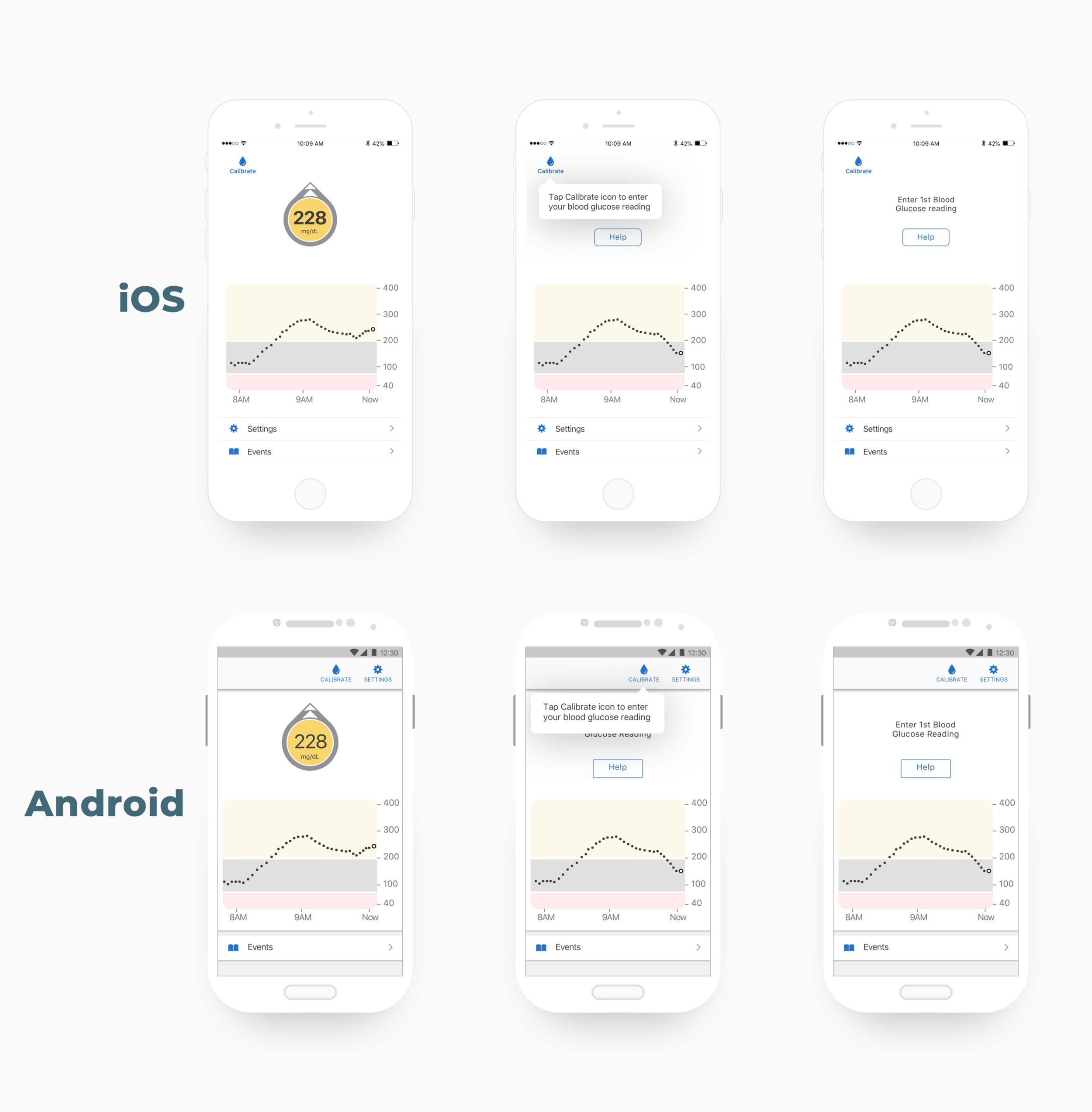
The Improved Home Screen
Drawing attention to dangerous glucose levels
Emphasizing potentially dangerous low and high glucose levels with color.
Guiding users to calibrate
When users first setup their G6 app they see a tooltip that teaches them how to calibrate. Messaging is later shown in the home screen to remind users. Users later will know to calibrate when they see the red badge on the calibration ingress in the top left corner of the screen.
Process
I took the following steps to meet our goals.
1. Ideate
I led brainstorm session with human factors engineers, developers, and designers. Aligned on concepts to prototype.
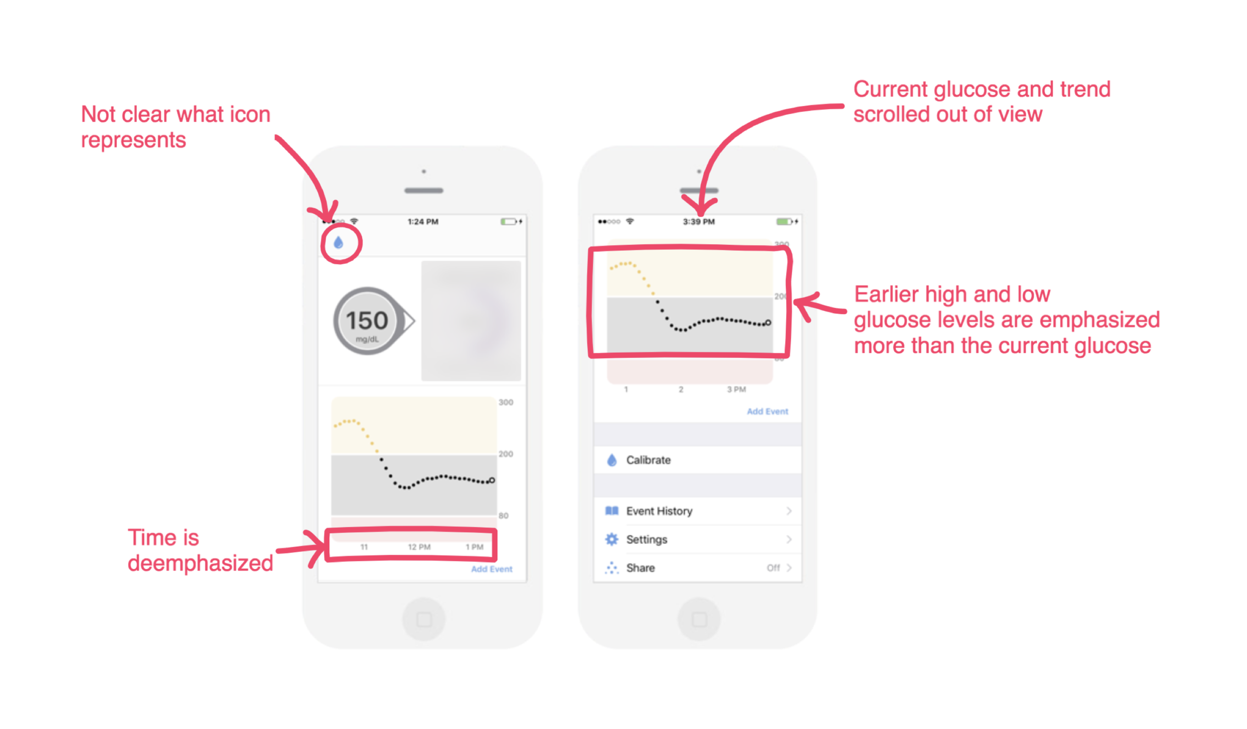
Test Findings
2. Test
During usability testing, we observed users would scroll further down the home screen and sometimes miss the current glucose level and trend. We also noticed users misinterpreting the unlabeled calibration icon.
3. Iterate
I worked with my visual design colleague to create prototypes for both iOS and Android. We reviewed them with app development, human factors, design, marketing, and project management, to make sure they properly addressed usability issues, were technically feasible, still met system marketing requirements, and could be implemented within our schedule. We iterated based on stakeholder feedback.
4. Document
Once we received alignment on updated requirements and design, I worked closely with my visual design colleague to document the changes in flows, interactions, screen layout, and component styling. We held daily stand-ups with developers to make sure we documented everything they needed for implementation.
Impact
No critical user errors in summative validation user testing (a critical step in the FDA approval process)
G6 system received FDA approval in March 2018
A review of the G6 system


